Sometimes it’s worth it. All the trouble, the endless meetings, the grant proposals, the paperwork, navigating bureaucracies, building consensus, wrangling volunteers, the phone calls, the e-mails, did I mention the meetings?
I started the Mid-City sign project last year, when I was serving as Communications Director for the Mid-City Neighborhood Organization. We wrote a grant to Mercy Corps to enhance our outreach in the neighborhood. We did posters and flyers, but by far the biggest chunk of change was devoted to signs.
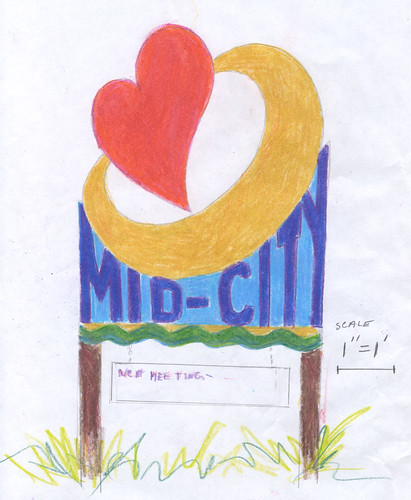
We commissioned a design from Madeleine Faust. Lili LeGardeur also helped with the conceptual phase. We asked Madeleine to do something unconventional, something funky, something that didn’t look like a typical neighborhood sign. We wanted a strong design, bold and defiant of convention, but also fun, artsy but not pretentious.
The design also includes a changeable hang-down part advertising our monthly community meetings. That was actually the primary rationale for the whole project.
We solicited bids from three local signmakers, and eventually went with Graffiti Graphics. (We found them through Stay Local.)
We commissioned six signs and started scouting locations throughout the neighborhood. We wanted to avoid a “gateway” effect, despite the fact that many neighborhood signs seem designed for that exact purpose. We didn’t want to draw boundaries. So we selected our locations accordingly.
That was the fun part. Then I tried to get approval from City Hall.
What a drag.
Six months later I was still trying, and my term on the board of MCNO was up. I decided not to seek re-election because of impending fatherhood. I handed off most of my responsibilities to others. I’m still their webmaster, but I was no longer riding herd on the sign project. A guy named Ben Claassen took over. He’s completing what I started, and over the weekend the first signs went up.
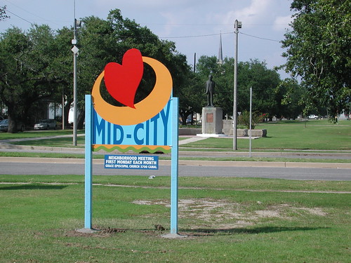
Xy spotted this one driving home from some errands Sunday. She was impressed at how good it looks, having been a bit of a skeptic. I immediately ran out to see it with my own two eyes, and take a picture.
I think the sign looks damn beautiful, with Jose Marti and the church steeple in the background.
There will be naysayers, I’m sure. A strong design will provoke strong reactions. Also, I wonder how the signs will weather. How will they look in a few years? And how long before one of them gets tagged with some graffiti?
But for now, I’m pretty happy. Sometimes it’s worth it. This is one of those times.
PS: I forgot to mention Jac Dudenhefer is helping Ben install these. At least I think he is. That’s the beauty of this thing. The torch really has been passed. I haven’t had to get my hands dirty because these two guys have been hitting it hard and heavy. Props to both.
Discover more from b.rox
Subscribe to get the latest posts sent to your email.


Saw one of ’em on Carrollton by the Rock N’ Bowl. They look great!
Love, love, love them! Well done.
Congrats on the signs Bart.
I spent much of my childhood living on Jeff Davis and Iberville many years ago.
What a lovely addition to my old neighborhood.
Well done, Bart (and colleagues)!!!
Beautiful!
Julie, we’ve got one coming even closer to your old block. Jeff & Conti I think.
It looks fantastic! Congrats, and thanks!
Nice work.
Noticed the one on Orleans Ave/Carrollton on Sunday morning. They look fabulous!
Congrats!
I think they look GREAT! I noticed a couple this week. Bold and memorable as intended. What a great gift to the neighborhood and the city.
Peace,
Tim