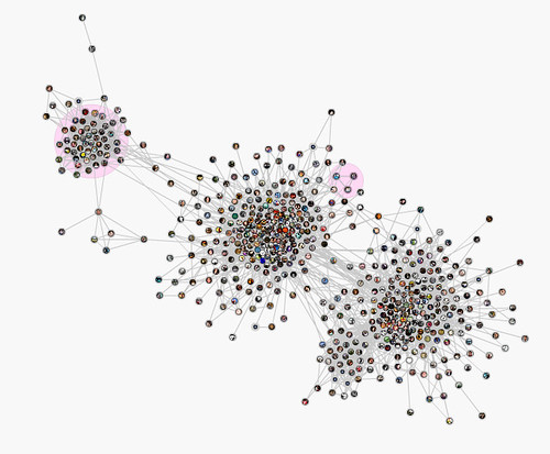
Here’s a screenshot of a graph of my social network on Facebook, generated with the Social Graph application.
This isn’t anything new, but I was interested to see the visualization. The three main clumps are, from left to right, my high school, Indiana (mostly Bloomington) and New Orleans. Some family members can be found in a tiny cluster off to the side. The University where I work is a lobe off to the lower left of the New Orleans cluster.
I’m not sure what the pink circles represent. The one in the upper middle contains three friends from Rochester, New York, but why they get a pink circle, as well as my high school, but not other groups — I don’t know.
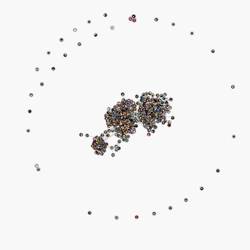
Here I’ve zoomed all the way out to reveal an outer circle of nodes. These are mostly singletons who aren’t connected to anyone else in my network. Note the mini-cluster at the top edge of the circle. These are three guys from Canada who came down to visit me on a crazy roadtrip in the mid-90s.
Discover more from b.rox
Subscribe to get the latest posts sent to your email.

